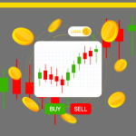
Ever felt like you’re trying to decipher an alien language when looking at crypto charts? Don’t worry, you’re not alone! Many newcomers to the crypto world find themselves overwhelmed by the squiggly lines, colorful indicators, and mysterious patterns that make up a typical trading chart. But fear not! By the end of this guide, you’ll be well on your way to becoming a crypto chart whiz. So, grab your favorite beverage, get comfy, and let’s dive into the fascinating world of crypto technical analysis!
Understanding Crypto Charts
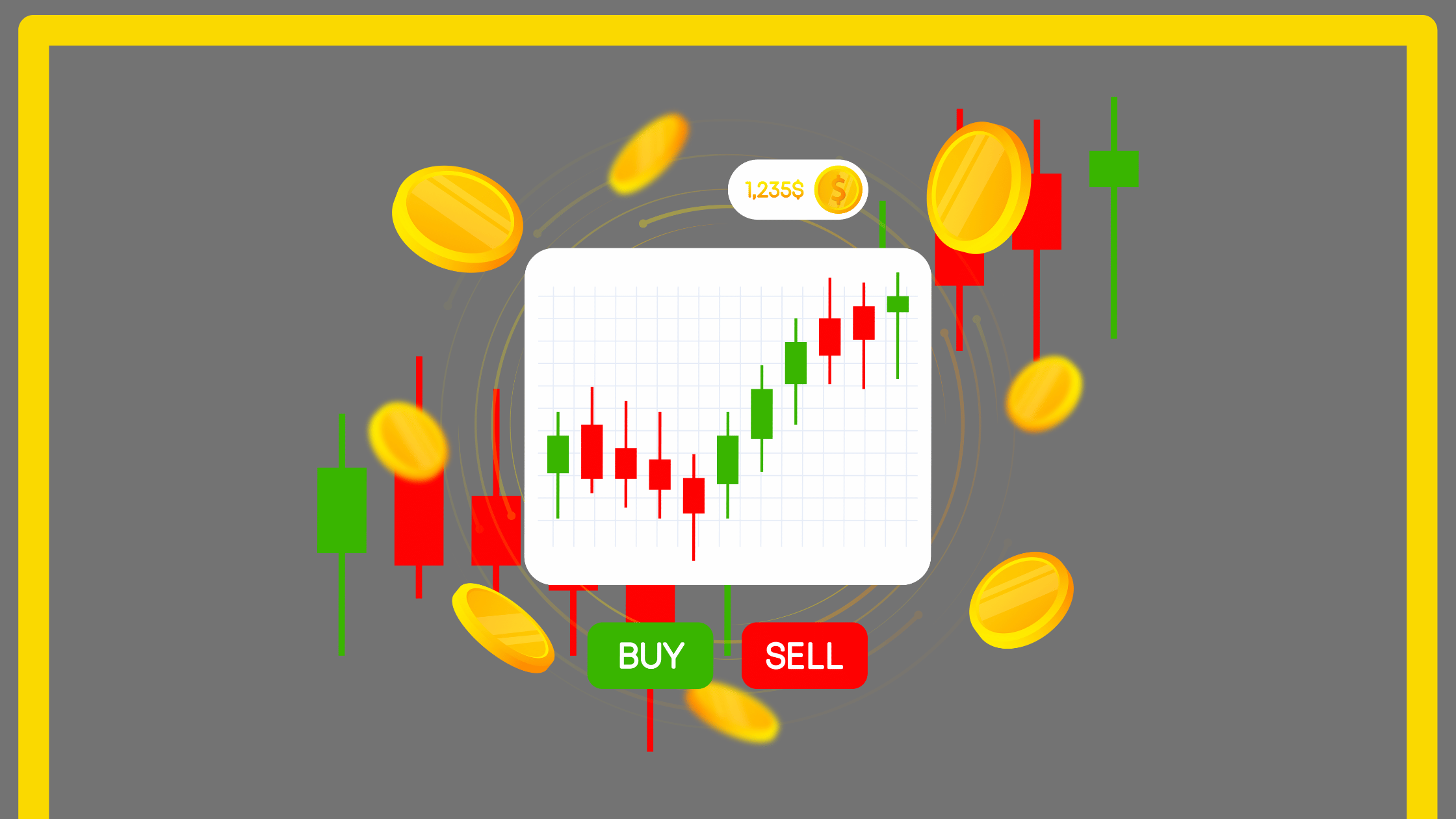
What Are Crypto Charts?
Think of crypto charts as the crystal balls of the digital currency world. They’re visual representations of a cryptocurrency’s price movements over time. Just like how weather charts help meteorologists predict storms, crypto charts help traders forecast potential price movements. Cool, right?
Types of Crypto Charts
Line Charts
Line charts are the simplest form of crypto charts. Imagine connecting the dots of closing prices over time – that’s essentially what a line chart does. It’s like drawing a route on a map; you see the general direction but might miss some details along the way.
Candlestick Charts
Now, if line charts are like a quick sketch, candlestick charts are the detailed oil paintings of the trading world. They pack a ton of information into each “candle,” showing the opening, closing, high, and low prices for a specific time period. We’ll dive deeper into these fascinating little fellows later.
Bar Charts
Bar charts are like the cousin of candlestick charts. They show similar information but in a different format. Think of them as the CliffsNotes version of candlesticks – less artistic, but still packed with useful info.
Basic Elements of a Crypto Chart
Time Frame
The time frame of a chart is like choosing the zoom level on a map. Are you looking at price movements over minutes, hours, days, or even months? Different time frames can reveal different patterns, just like how zooming in or out on a map can show you streets or entire continents.
Price Scale
The price scale is usually on the right side of the chart, showing you how much the crypto is worth. It’s like the altitude markers on a hiking trail – it tells you how high (or low) you’ve climbed.
Volume
Volume bars are often at the bottom of the chart, showing how much of the cryptocurrency was traded in each period. Think of volume like the traffic on a road – more cars (or in this case, trades) usually means something interesting is happening.
Reading Candlestick Patterns
Anatomy of a Candlestick
Alright, let’s zoom in on these fascinating candlesticks. Each candle is like a tiny story of a trading period. The “body” of the candle shows the opening and closing prices, while the “wicks” or “shadows” show the highest and lowest prices reached during that time.
- If the body is green (or white), it means the price went up during that period. Yay!
- If it’s red (or black), the price went down. Boo!
Common Candlestick Patterns
Doji
A Doji looks like a cross or a plus sign. It’s when the opening and closing prices are nearly the same. It’s like when you go on a long hike only to end up right back where you started – it might signal indecision in the market.
Hammer and Hanging Man
These patterns look like, well, a hammer or a hanging man (don’t worry, it’s not as morbid as it sounds). They have a small body with a long lower wick. A hammer at the bottom of a downtrend might signal a reversal upwards, while a hanging man at the top of an uptrend might warn of a potential drop.
Engulfing Patterns
Engulfing patterns are when one candle’s body completely engulfs the previous candle’s body. It’s like one sumo wrestler pushing another out of the ring – it can signal a strong shift in market sentiment.
Understanding Trend Lines
Uptrends and Downtrends
Trend lines are like the general direction of a river’s flow. An uptrend is a series of higher highs and higher lows, like a staircase going up. A downtrend is the opposite – lower highs and lower lows, like a slide at a playground.
Support and Resistance Levels
Support and resistance levels are like the floor and ceiling of a room. Support is a price level where a downtrend can be expected to pause due to increased demand. Resistance is the opposite – a price level where an uptrend is likely to pause due to increased supply.
Popular Technical Indicators
Moving Averages
Moving averages smooth out price data to create a single flowing line. It’s like looking at the average temperature over a week instead of the ups and downs of each day. They help identify the overall trend direction.
Relative Strength Index (RSI)
The RSI is like a speedometer for price changes. It measures the speed and change of price movements, helping to identify overbought or oversold conditions. An RSI above 70 typically suggests overbought conditions, while below 30 suggests oversold conditions.
Moving Average Convergence Divergence (MACD)
The MACD is like a navigational system for trends. It helps identify when a trend is potentially starting or ending by showing the relationship between two moving averages.
Chart Patterns to Watch For
Head and Shoulders
This pattern looks just like it sounds – a left shoulder, a head, and a right shoulder. It’s often seen as a reversal pattern, signaling that an uptrend might be about to reverse into a downtrend.
Double Tops and Bottoms
Double tops look like an “M,” while double bottoms look like a “W.” They can signal a potential reversal in the trend. It’s like a ball bouncing twice before changing direction.
Triangles
Triangle patterns occur when the price consolidates between converging support and resistance lines. They can be symmetrical, ascending, or descending, each potentially signaling different future price movements.
Applying Technical Analysis to Crypto Trading
Setting Up Your Chart
When setting up your chart, start simple. Choose a time frame that suits your trading style, add a couple of moving averages, and perhaps an RSI. It’s like setting up your workbench – you want the tools you need most within easy reach.
Identifying Entry and Exit Points
Use a combination of patterns, indicators, and your own analysis to identify potential entry and exit points. Remember, no single indicator is perfect – it’s about building a complete picture, like piecing together a puzzle.
Common Mistakes to Avoid
- Over-complicating your charts: Don’t turn your chart into a Christmas tree with too many indicators!
- Ignoring the bigger picture: Zoom out sometimes to see the overall trend.
- Emotional trading: Don’t let fear or greed cloud your judgment.
- Forgetting about fundamentals: Charts are great, but they’re not everything.
Combining Technical Analysis with Fundamental Analysis
While technical analysis is powerful, don’t forget about fundamental analysis. This involves looking at the bigger picture – things like project developments, partnerships, and overall market conditions. It’s like considering both the car’s performance and the road conditions before a long drive.
Conclusion
Congratulations! You’ve just taken your first big step into the world of crypto chart reading and technical analysis. Remember, becoming proficient at reading charts is like learning a new language – it takes time, practice, and patience. Don’t be discouraged if it seems overwhelming at first. Keep practicing, stay curious, and soon you’ll be spotting patterns and trends like a pro!
 Bitcoin
  Ethereum
  Tether
  BNB
BNB  Solana
  USDC
USDC  XRP
XRP  Dogecoin
  Toncoin